Rebranding MOMA museum (concept)
When visiting museums, we involuntarily compare artists, their works, how they are made, how this or that effect is achieved and what emotions and sensations call us.
Therefore, the corporate identity of the museum is built on the principle of comparing different works, as they interact with each other in the same space.
«Conflict» in the work of the selected artist served as the principle for creating animation
Therefore, the corporate identity of the museum is built on the principle of comparing different works, as they interact with each other in the same space.
«Conflict» in the work of the selected artist served as the principle for creating animation
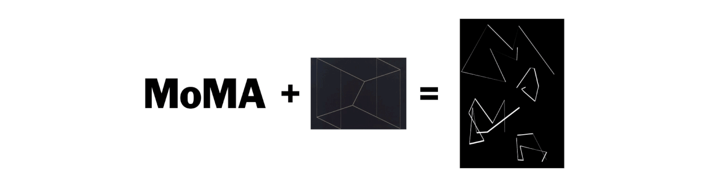
At the first stage, the letters of the museum logo and a random work of the artist were taken as the basis from the permanent exhibition. An animated logo was obtained, which later served as one of the layers of graphic elements. You can also use any freeze frame from the resulting animation as a full-fledged logo
The second step was to combine the work of the selected artist and the main text block with information about the time of visit and the location of the museum


The third stage was the combination of an animated logo, a text block and another work from the museum collection of another author. The second work was beaten with animation from the name of the author and the "conflict" in his work. Get multi-layered shapes


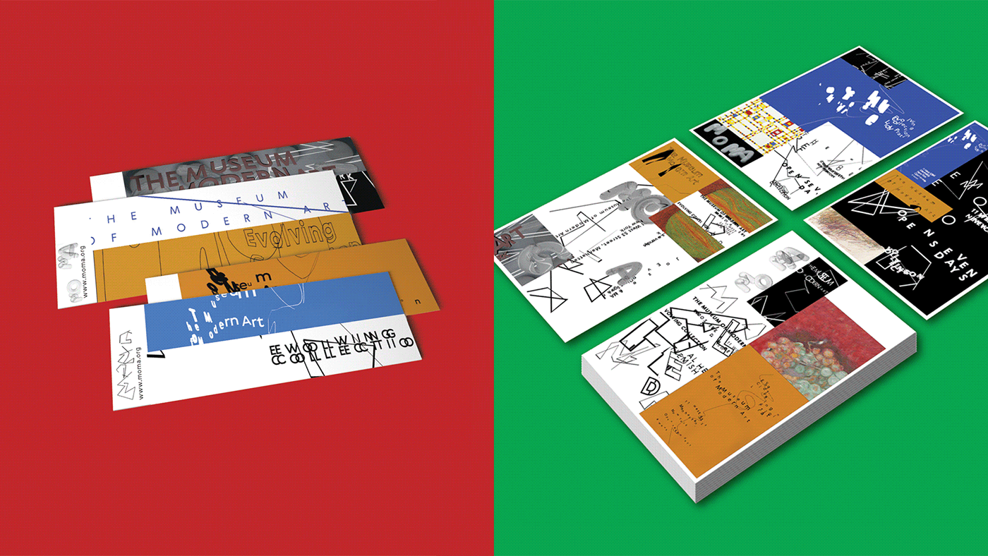
In the corporate style, I wanted to display the diversity of the exposition and the artists represented in the museum. Another step has been added. To freeze frames from sheets with animation from the previous stages, fragments of the artists' works were added. This resulted in brighter, more colorful and diverse variations, which became the basis for souvenirs, posters and tickets.